Types
There are four types of icons: Outlined, Filled, Off, and Contained.
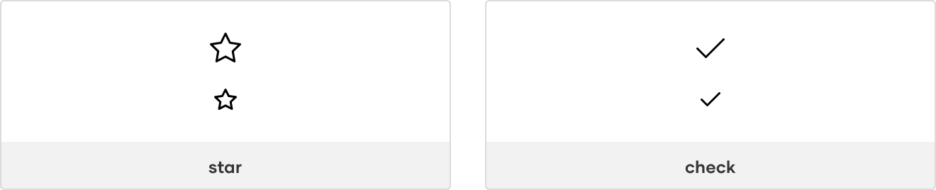
Outlined
Outlined icons are icons with a standard outline.
Use Outlined icons by default.
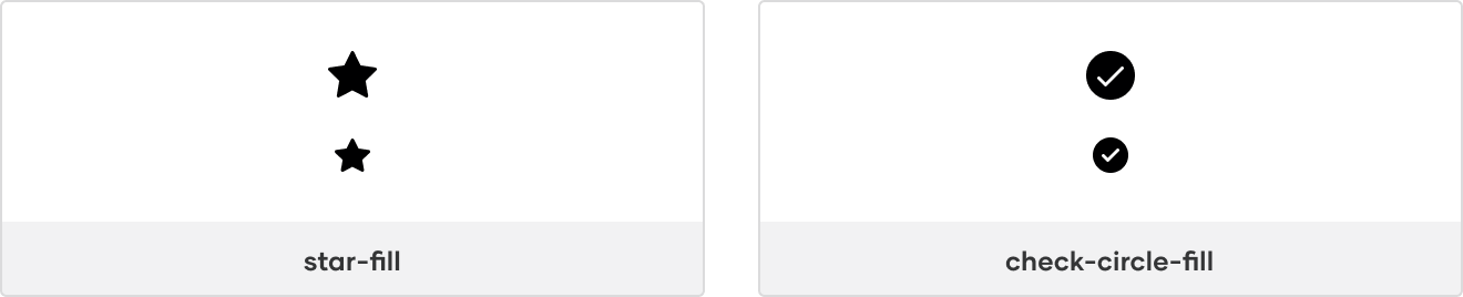
Filled
Filled icons are icons with a solid fill and are indicated by -fill in the icon name.
Use Filled icons to show a toggled state or for contrast with Outlined icons.
Indicating a toggled state
For objects that can be toggled on/off, show the Outlined icon for off and the Filled icon for on.
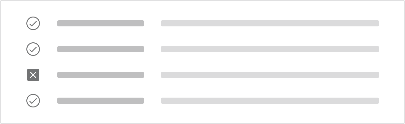
Using for contrast
If contrast against other icons is important, use Filled for the more important icon(s).
For example, when showing one failure in a list of 20 otherwise successful builds, use x-square-fill while keeping the remaining icons in the Outlined style so the failure is more prominent.
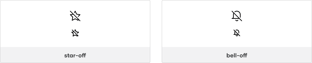
Off
Off icons are icons including a strike-through and are indicated by -off in the icon name.
Use Off icons to indicate something is disabled, unavailable, or will return a toggled icon off.
Indicating a disabled or unavailable icon
When needing to indicate an action is disabled or unavailable, consider pairing an Off icon with the color style Foreground/Disabled and cursor property value not-allowed.
Return toggled state back off
If an object is toggled on and it can be toggled off, consider showing the Off icon on hover to indicate that clicking the icon again will toggle the object back off.
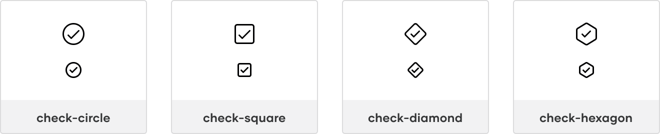
Contained
Contained icons are icons with a containing shape and are indicated by their shape type in the icon name, e.g., -circle, -square, etc.
Use contained icons for emphasis in the hierarchy.
If an object can have multiple states, use a Contained icon for the overall parent state and the Outlined icon(s) for the children’s state(s).
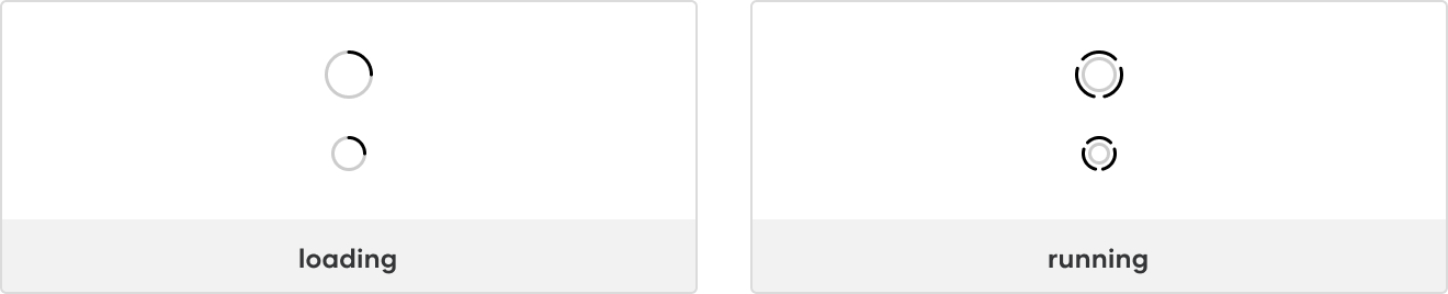
Animated
Animated icons are icons with an animated effect that show a transition between two states.
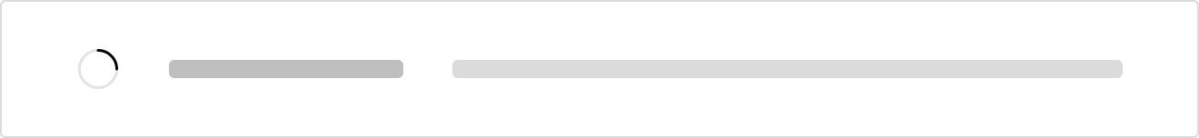
Use animated icons to communicate activity happening in the background. For example, when an object is updated, the loading icon could appear after the save action is triggered, indicating that the changes are in progress.
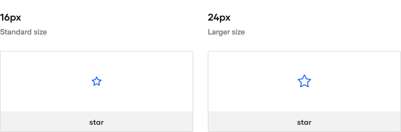
Sizes
Icons are optimized for two icon sizes: 16px and 24px.
Use 16px icons by default in product interfaces and 24px icons for empty states.
States
Icons frequently represent different states within product interfaces, most commonly as states of an object or states of feedback.
States of an object
Some objects can return a state, e.g., a Build, Run, Cluster, etc. Objects are typically displayed in lists or as cards and include their state when presented to the user.
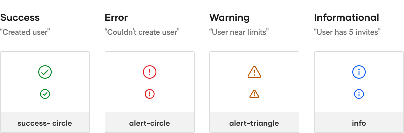
States of feedback
Feedback is presented in response to user interaction, such as a displaying a success message after submitting a form or a warning when a user nears their usage limit.
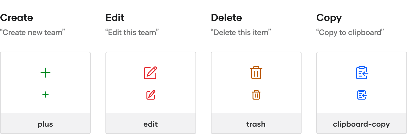
Common icons
Some icons represent common actions within our products.
Editing actions
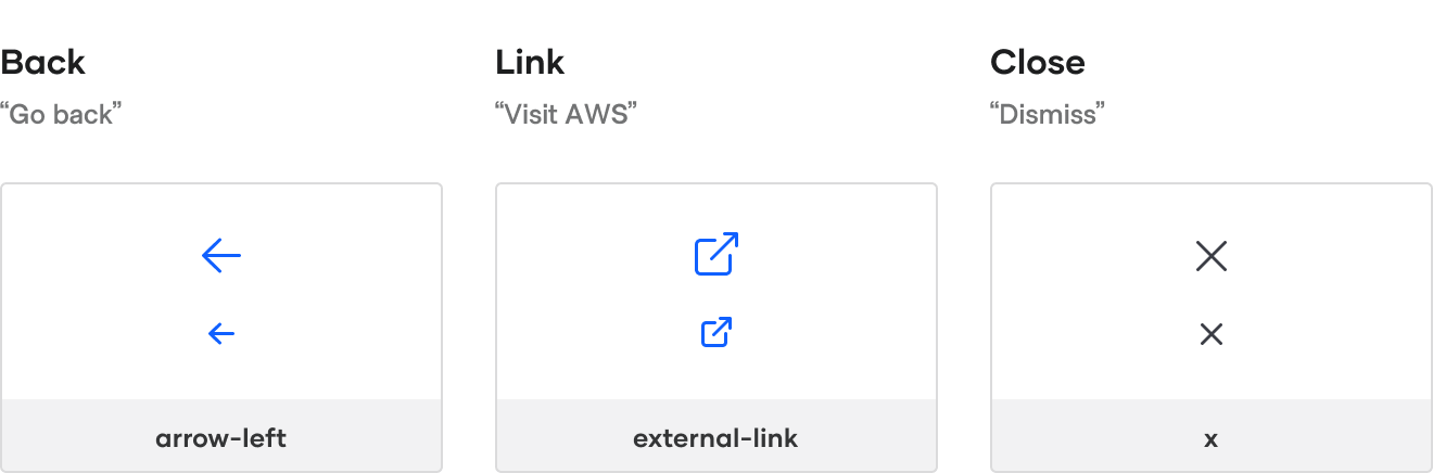
Navigation actions
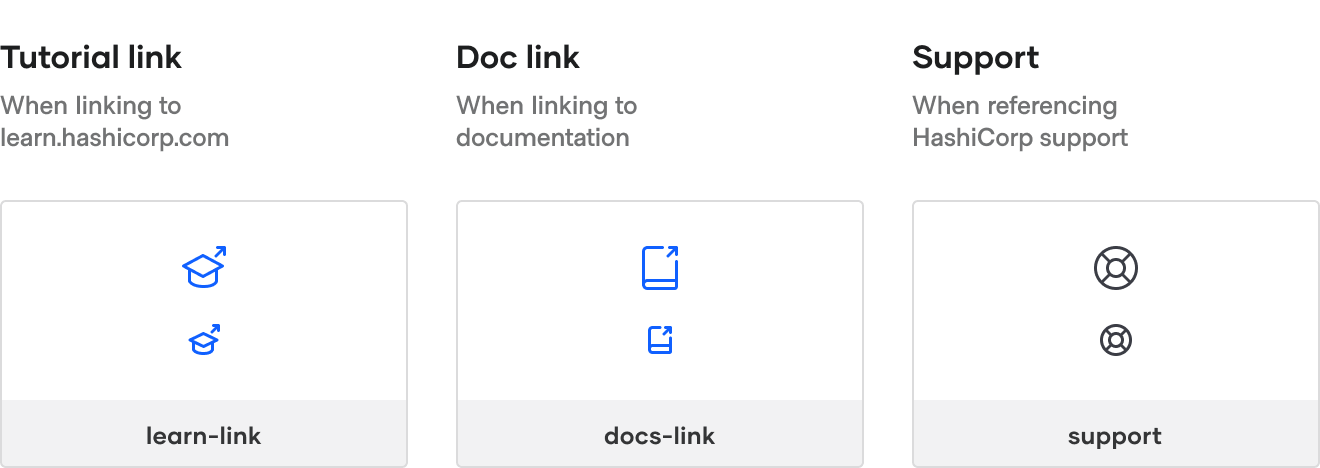
Help actions
Migrating from Structure
Choosing the correct icon
When migrating icons from Structure, reference our mapping of icon names between Structure and Helios.
Choosing the correct size
| Structure icon size | Helios icon size |
|---|---|
| <= 20px | 16px |
| >= 21px | 24px* |
*If 24px seems too large, consider using the 16px icon and reworking the interface for a better fit.
Resources
- Figma library (Internal only)
- SVG assets (ZIP file)
- Request an icon (Internal only)
- Report an issue
How to use icons
Icons can be used in many ways. The package can be installed as an Ember addon for the convenience of using a component with strong defaults. It can also be consumed in React applications via direct import of the SVG file or as a standalone React/SVG icon component.
Using icons in Ember apps
Installing the ember-flight-icons addon
yarn add @hashicorp/ember-flight-icons
Understanding the component
The component comes with the following defaults:
fillattribute: set to currentColor.idattribute: a unique, automatically generated id.aria-hiddenattribute: set to true.heightandwidth: default size of 16x16 (px).stretched: if the SVG should have 100% width/height (stretch to fill the parent)—defaults to "false".- (CSS)
class: flight-icon, flight-icon-{name}, flight-icon-display-inline. - CSS display: set to
display:inline-block. data-test-iconattribute: for the author’s testing convenience; set to the value of the@nameproperty.
This makes the base, required invocation quite terse—@name is the only property that requires specification. So this invocation:
<FlightIcon @name="alert-circle" />
Renders to this (where the ID will be unique each time):
<svg
    id="icon-ember115"
    class="flight-icon icon-alert-circle display-inline"
    width="16"
    height="16"
    viewBox="0 0 16 16"
    xmlns="http://www.w3.org/2000/svg"
    fill="currentColor"
    aria-hidden="true"
    data-test-icon="alert-circle"
>
    <use href="/@hashicorp/ember-flight-icons/icons/sprite.svg#alert-circle-16"></use>
</svg>
The <use> element will then render the correct SVG to the shadow DOM.
Customizable properties
The following properties are customizable:
Fill
To customize the fill attribute, set the @color value. To ensure consistency with our design language, we recommend using one of the pre-defined variables:
<FlightIcon @name="zap" @color="var(--brand)" />
Other accepted values include named colors and color values themselves (e.g., hex, rgb, etc).
<FlightIcon @name="zap" @color="rebeccapurple" />
<FlightIcon @name="zap" @color="rgb(46, 113, 229)" />
Size
To use the 24px icon size, set the @size value:
<FlightIcon @name="zap" @size="24" />
Stretched
To have the icon fill the parent container (width: 100%, height: 100%, display: block), set the @stretched attribute:
<FlightIcon @name="zap" @size="24" @stretched= />
CSS classes
To append additional classes to the component, add class with value(s):
<FlightIcon @name="triangle-fill" class="ds-rotate-90" />
CSS display
To change the default display from inline-block to block, set @isInlineBlock to false:
<FlightIcon @name="triangle" @isInlineBlock= />
<FlightIcon @name="triangle-fill" @isInlineBlock= />
Animated icons
Animated icons (e.g., "loading" and "running") are animated by default, meaning no additional properties are needed.
<FlightIcon @name="loading" @size="24" />
Using icons in React apps
To use icons in a React application, install the @hashicorp/flight-icons package and import the icons as either inline SVGs or as a standalone React/SVG component.
Installing the flight-icons package
To install, run:
yarn install @hashicorp/flight-icons
Importing icons as inline SVGs
Single icons can be imported and used directly as SVG files using <InlineSvg> provided by @hashicorp/react-components.
Since this is just an SVG asset, no props can be passed. You should refer to the <InlineSvg> documentation to know how to apply color and size to the SVG icon.
// import the SVG file (using 'require')
const iconArrowRight = require('@hashicorp/flight-icons/svg/arrow-right-24.svg?include');
// or import the SVG file (using 'import')
import iconArrowRight from '@hashicorp/flight-icons/svg/arrow-right-24.svg?include';

// elsewhere in the file
<InlineSvg src={iconArrowRight} />

// alternatively you can also use a similar approach
<InlineSvg src={require('@hashicorp/flight-icons/svg/arrow-right-24.svg?include')} />
Importing icons as React/SVG components
Single icons can be imported and used directly as standalone React/SVG components:
// import the React/TypeScript file (using 'require')
const { IconArrowRight24 } = require('@hashicorp/flight-icons/svg-react/arrow-right-24');
// or import the React/TypeScript file (using 'import')
import { IconArrowRight24 } from '@hashicorp/flight-icons/svg-react/arrow-right-24';

// elsewhere in the file
<IconArrowRight24 />
Customizable properties
The component exposes the following props:
color—the color (applied as fill) to the SVG—by default iscurrentColorbut any valid HTML/CSS color is accepted.title—the title of the SVG—by default, the icon has an aria-hidden attribute applied to it because it is expected to be used in context (check out § Accessibility); if instead you need to use it without text associated to it, you have to pass a title attribute to make it accessible....props- any other prop passed to the component will be applied via spread.
The size of the icon is determined by the size of the asset imported (each icon is exported in two sizes, 16 and 24). If you need a different size, use CSS to override its intrinsic size.
Aligning icons
By default, the FlightIcon component has an inline-block display value (this can be changed using the @isInlineBlock argument). This means that the icon behaves like an inline element, and that if you want to vertically align it in relation to other sibling elements, you have to use CSS to achieve the expected result.
For example, to visually center an icon with a generic text node, you will need to use a parent flex container with align-items: center.
Animated icons
Some of the icons are meant to be animated (e.g., “loading” and “running”). To use them, import the CSS that controls the icons’ animation:
// the path here depends if you’re using 'svg-react' or 'svg' icons
@import ~@hashicorp/flight-icons/svg-react/animation.css';
Then declare them the same way you would with any other icon.
// if you’re using the 'svg-react' icons
import { IconLoading16 } from '@hashicorp/flight-icons/svg-react/loading-16'
<IconLoading16 />

// if you’re using the 'svg' icons
import svgLoading16 from '@hashicorp/flight-icons/svg/loading-16.svg?include'
<InlineSvg src={svgLoading16} />
Accessibility
Accessibility support for SVGs is inconsistent across browsers and assistive technology. Currently, the best practice is to set the aria-hidden attribute to true on the SVG itself. This means that the icon (both the singular icon and the icon component) will need to be used in context. The icons themselves are for presentation purposes only and should never be used on their own.
However, as a temporary bridge, while we work to provide the accessible components in the design system, we have provided the ability to add a title element to the Ember component by defining a value for the @title property. This is a temporary measure, and we strongly encourage UI engineering teams to work with their designers and plan to convert any standalone icon use.
Examples of correct use
<button aria-label="Check activity">
    <FlightIcon @name="activity" />
</button>
<h2>
    Activity report <FlightIcon @name="activity" />
</h2>
Some additional best practices include:
- Use icons at 16px or 24px. Use at other sizes sparingly.
- Icons do not have a unique id generated; take precautions to avoid related accessibility conformance failures.
Migrating from Structure
Choosing the correct icon
When migrating icons from Structure, reference our mapping of icon names between Structure and Helios.
It’s possible to write codemods to automate this migration. If you’re interested in learning more, contact #team-design-systems (Internal only).